AO - the story behind the logo
- Details

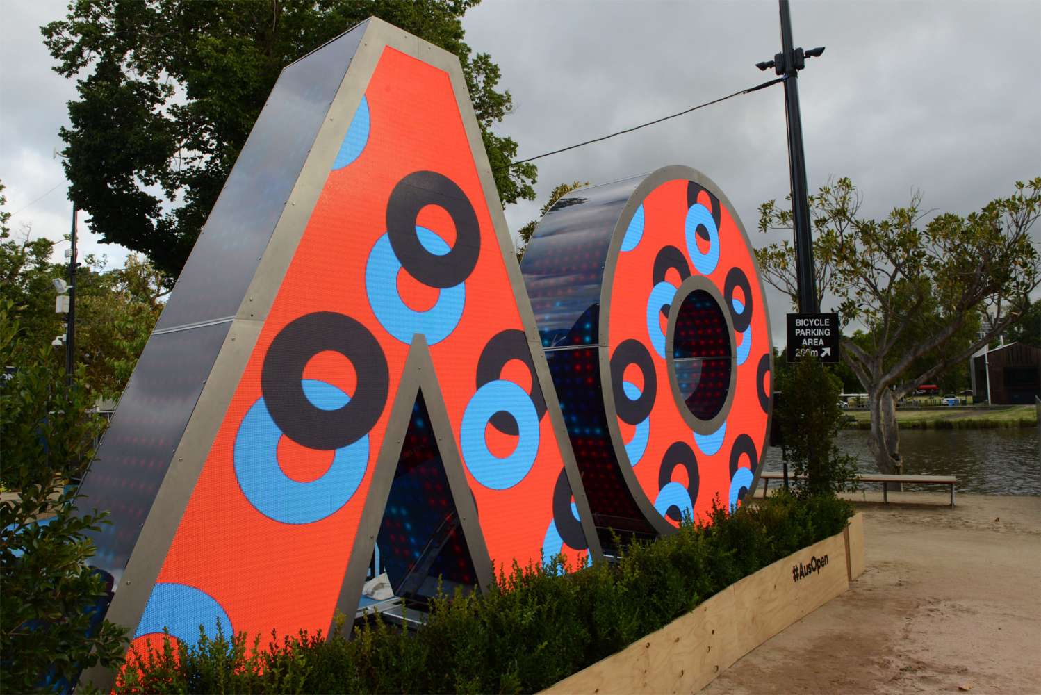
Australia - As part of their pitch for the rebranding of the Australian Open, Landor, Tennis Australia’s chosen branding agency, created a video rendering of their proposed logo. The rendering depicted a 3m high three-dimensional logo, complete with a video screen on its front and LED pixels covering the side surfaces.
Whilst not part of Landor’s actual deliverable, the concept inspired Tennis Australia to test the market to see if it were possible.
The technical team at Tennis Australia prepared and issued a specification in August last year. Sydney’s The P.A. People, who had worked with Tennis Australia on many events over the years, took up the challenge.
“Our experience in designing bespoke mechanical solutions as part of AV systems integration, coupled with our work around the world on large scale events, led us to believe we could create a viable and cost effective solution” said Chris Dodds, managing director - The P.A. People and lead designer of the AO logo project.
“The P.A. People took a concept and brought it to life with an extraordinary feat of engineering. The AO installation became a cornerstone of our international brand roll out and it captivated our audiences with its sheer size and stunning imagery. The team at The P.A. People are to be commended for working with us on such a complex project in such a short timeframe; the evidence of its success is in the exposure the installation had during the tournament,” said Jo Juler, head of marketing for AO.
Chris Dodds outlines the process: “Our solution was based on a stainless-steel space frame structure, similar to the construction of an airframe. Each of the 440 pieces of stainless steel was laser cut and folded from one of 230 separate patterns and then assembled in our workshop with a combination of bolts and rivets.
“The fabrication did not rely on a frame per se - rather, a combination of flat 3mm panels and lateral spokes or ribs provided the structural integrity required. We chose stainless steel to provide a durable and elegant surface for the logo over time - we felt that paint was simply not an option given its proposed deployment in public spaces.”
The assembled screen is some 3.2m high, almost 7m long and 850mm deep. It weighs some 2.5tonne. The system is designed to fit in its own 20’ High Cube shipping container, incorporates its own media server and sound system and is complete with its own stage.
“Tennis Australia arranged some exceptional content, through both Sydney-based animation agency Looper and Tennis Australia’s own media team, which brought the logo to life. Without the fantastic content the screen would have been an elegant sculpture. With the imagery, it became the focus of the entry to the Australian Open Festival in Birrarung Marr and gained a significant level of social media coverage in its own right,” concluded Chris Dodds.
(Jim Evans)


